

Which Colors Should You Choose to Boost Productivity at Work?
Which Colors Should You Choose to Boost Productivity at Work?
August 25, 2026
By Hamster | BURO & Cie
When it comes to designing a workspace, several elements are taken into consideration: furniture, lighting, ergonomics and organization. But what about color?
For several years, researchers have been studying the influence of colors on our emotions, perceptions and certain behaviors. While colors alone cannot transform our level of productivity, they can help create an atmosphere that may support concentration, creativity and overall well-being at work.
Do Colors Really Have an Impact on Productivity?
Several studies have explored the influence of colors on emotions, perception and behavior. The color of an environment can influence mood, levels of stimulation and the way a person perceives their workspace.
In an article published by Forbes1 , Lasse Karvinen , Product Manager at Framery, points out that colors do more than influence our mood: they can also have an impact on our level of productivity. According to him, this reality is encouraging more and more companies to think carefully about the design of their workspaces in order to promote both employee well-being and efficiency.
However, this does not mean that a single color can make someone more productive. Lighting, layout, noise, comfort and personal preferences also play an important role.
So, which color should you choose for your workspace?
Blue: Concentration and Confidence
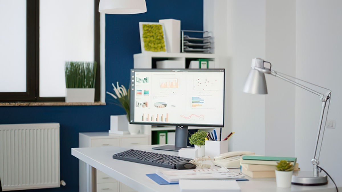
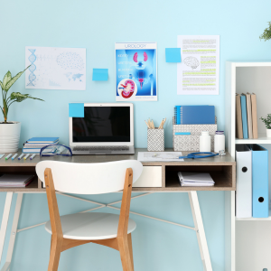
Blue is often associated with calm, stability and concentration. It is also one of the most commonly used colors in professional environments.
This color can help create an atmosphere that is conducive to thoughtful work, analysis and tasks requiring sustained attention. It is particularly well suited to administrative offices and spaces where concentration is essential.
However, it is important not to overuse it. The goal is not necessarily to paint an entire office blue, but rather to incorporate this shade through furniture, accessories or certain decorative elements.
Red: Energy and Dynamism
Red is a warm color often associated with energy, passion and action.
In certain contexts, it can help increase levels of attention and stimulation.
It can therefore be an interesting choice for adding energy to a workspace, particularly when used as an accent color.
As with blue, a large amount of red can make an environment feel visually intense. In an office, a few touches of red may therefore be more effective than an entirely red space.
Yellow and Orange: Stimulating Creativity
Yellow and orange are also warm colors that can create a sense of energy and dynamism.
Yellow is often associated with optimism and creativity. It can be an interesting choice for spaces where the goal is to encourage ideas, discussion and creative thinking.
Orange, meanwhile, creates a warm and dynamic atmosphere. It can be particularly well suited to collaborative spaces or meeting areas.
Once again, moderation is key. A few touches of color in accessories, posters or certain pieces of furniture may be enough to energize a space.
Pink: A Touch of Softness
Pink is generally associated with positive emotions, softness and calm. Some research has also explored its potential effect on the perception of stress and aggression.
In the workplace, pink can therefore be used to add a warmer touch to an environment, particularly in break rooms or common areas.
White and Beige: Brightness and Simplicity
Neutral colors such as white, beige and light tones are very popular in work environments.
They create a sense of simplicity and cleanliness. In an office with large windows and plenty of natural light, light shades can also help create a bright and airy space.
The downside? An environment made up entirely of white and very neutral colors can sometimes feel cold or impersonal.
To avoid this effect, combine neutral tones with wood, plants, colorful accessories or a few decorative elements that add personality to the space.

Black and Grey: Elegance and Character
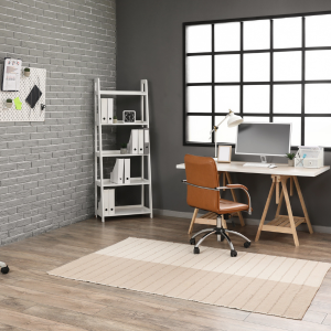
Black, grey and darker shades can create a sense of elegance, seriousness and authority.
They can be particularly interesting for creating a professional and sophisticated atmosphere. For example, black or grey furniture can easily be paired with lighter walls and colorful accessories.
Once again, balance is important. When used in large quantities, dark tones can make a space feel darker, especially when it receives little natural light.
So, Which Color Should You Choose for Your Office?
There is no universal color that will make everyone more productive. The best choice depends on the atmosphere you want to create and the type of work being performed in the space.
A space dedicated to creativity may benefit from more stimulating colors, while an office where concentration is essential may favor softer and more calming shades.
The ideal approach is therefore to create a balance between colors, lighting, furniture and the different work areas.
In Conclusion
Colors can help shape the atmosphere of a work environment and influence how we perceive it. Each color has its own associations and can find its place in a professional setting.
But productivity doesn't depend solely on the color of your walls! A comfortable, well-lit, ergonomic workspace adapted to your team's needs is just as important.
At Hamster | BURO & Cie, we offer a variety of solutions to create functional workspaces tailored to your professional needs.
1. Source: Forbes, How Color Psychology Impacts Today's Workplace. https://www.forbes.com/sites/jeffsteele/2020/01/06/how-color-psychology-impacts-todays-workplace/
Need Help Creating an Inspiring Workspace?
Our team can help you choose furniture, accessories and solutions tailored to your professional environment.
Contact Us